|
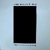
Like other important music labels (FAX Records, Instinct Ambient, em:t, Recycle or Die!, etc.) Silent Records had a look to their releases. A certain aesthetic, influenced by
the rave, electronic and chill-room culture of the 90s, was prevalent in the overall look and feel of Silent Records. From before the first CD release until her departure from the label in 1996, Kathleen
(Kat) Cascone was primarily responsible for the graphic design of Silent Records.
Kat met Kim Cascone after the label had already been started. She used her graphic art knowledge to help with the cover art, typesetting and layout of the early vinyl
releases. It wasnt long before she found herself in a more prominent role as art director and designer for the label. It is interesting to follow the style of artwork and design from the early black and
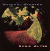
white, minimal, industrial vinyl releases, through the simple early CD release to the brilliant rave flyer releases of the golden age of Silent and ambient music.
Things really started to take shape when famed artist/designer Nick Phillip began doing artwork for Silent. Mindmeld and Andrew Frith also contributed cover art during the
mid 90s. This was the era of the rave flyer. San Franciscos rave culture played a big part in the Silent aesthetic during this time and Kats designs are recognizable to anyone familiar with this
period.
It is important to note that the allure of ambient music during the mid 90s goes beyond the music. The artwork, design and packaging is so important to those who lived it and
those who collect it. Kats work with Silent cant be underestimated.
Behind the scenes, Kathleen and Kim married and had a son, Cage, while the Silent offices were at their busiest. This dynamic was another important factor in the success of
Silent Records. Kathleen continues to work as a graphic designer for a San Francisco company.
|


